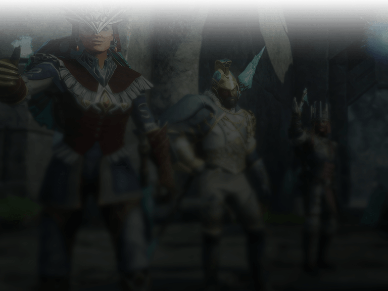
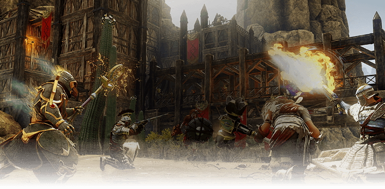
This Just Looks Bad

There are some quality issues with the inventory screen since the latest patch. Specifically the inclusion of a space for camping and the size of the text for the weight amounts.

For the camping, the image does not have a background like the other spaces, lacks the key bind indicator of Y, and the image is severely skewed.

For the weight amounts, the new size of the text causes them to overwrite certain categories such as Alchemy and Arcana.

With all do respect to the people who worked on these specific things, the result looks rushed, amateurish, and slapped together at the last minute.

Amazon should be doing better than this, and quite frankly this is low-hanging fruit stuff that should be immediately resolved. As it is now it just looks sloppy, like you all are cutting corners in an otherwise fantastic update.

This topic was automatically closed 30 days after the last reply. New replies are no longer allowed.